
Hello. My name is Karolina and I am a graphic designer at Abante Marketing. This is my very first blog post and I’m psyched to share some of my knowledge with you. In a previous post from Seth Ellenwood, you read about the differences between raster and vector art. So, now that we know that, let me tell you how to prepare your ready-to-go vector files for submission.
In the design world, vector art is the preferred format for production files. Promo product suppliers and screen-printing businesses absolutely love receiving clean, ready to use vector art. If you work with vector programs, and have a basic knowledge on how vectors work, you might feel like it would be cool to see your very own design on your t-shirt or promotional product. It’s always fun to see your creation appear on different products! This is one of the reasons I love my job. So, here are a couple of tips to make sure your art is reproduced accurately on your order.
CONVERT THAT TEXT TO OUTLINES
First, you begin by designing something in a vector friendly program, then you save it as *.ai, *.eps or *.pdf (vector) file and then send it off to the manufacturer. All this might sound fun and dandy if you are dealing with, let’s say, simple one-color designs that don’t have any text. But, more often than not, art departments receive files that are not prepared correctly. The most common mistake is submitting files without converting the text to outlines (or expanding). Let me show you what I’m talking about.
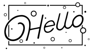
What your design looks like on your screen (because you have the font installed on your computer):
What your design looks like on our screen (pink background around text indicates the font is missing, because we don’t own the font you’ve used):
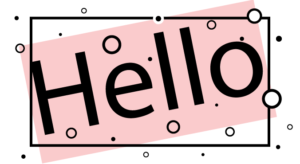
Because fonts aren’t free, manufacturers will most likely tell you the file is not usable, and you will need to send a new file with text outlined before they can move forward with placing it on the item of your choice. So, to save time, it’s always a good idea to outline the text before submitting it.
SIMPLIFY, SIMPLIFY, SIMPLIFY
Second, it’s always helpful if a complicated illustration or logo is simplified. What do I mean by that? Let me show you.
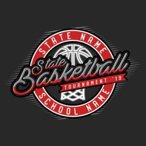
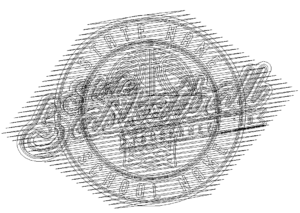
Let’s use this image as an example. It looks good at first glance, nothing crazy or too busy, right?
Now, in Adobe Illustrator we have this trick where we can see how busy the art is by clicking CTRL + Y (Windows) to reveal all overlapping objects. Let me show you what it looks like now:
What a mess… all these lines are separate objects, which is super useful if the design isn’t finished yet. In this form you can still move all the objects around separately until you get the look that you want. But, when submitting it to be produced, it is always a good idea to merge the colors and “flatten” the image. Let me show you what it looks like after that’s done:
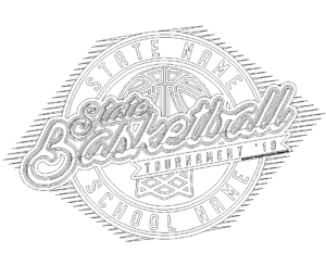
Much better, right?
In order to do this, follow the steps below:
- Select the entire illustration with your Selection Tool.
- Expand outlines, text, etc. Object > Expand (sometimes this step needs to be repeated several times).
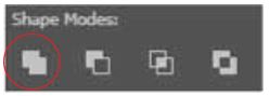
- Open your Pathfinder panel (Window > Pathfinder).
- Click Divide
 This will divide all the overlapping objects and will create a big mess. The next step will reveal how to clean that mess up.
 - After the illustration has been divided it will be grouped automatically. Meaning, you can move it around as a single object. But we don’t want that… ungrouping it isn’t a great idea, I will explain why in a bit. So, we will need to do something else first.
- We need to select each color separately and merge it. The easiest way to do that is to double click the divided illustration and take it to isolation mode, which means nothing else in the window can be edited but the illustration.
- Next, use the Selection Tool and click on one of the colors. Go to Select > Same > Fill Color and use the Unite tool in Pathfinder panel.
Now, imagine if you ungrouped the illustration before taking it to isolation mode. You would have been selecting the colors from an entire artboard! Of course, if the illustration you are editing is the only vector on the artboard, then don’t bother entering isolation mode. But as an artist, I keep my artboards very, very messy with tons of ideas, layouts and combinations… it’s like your very own mood board!
- Now, repeat step #7 until all colors are merged and Voila! You are done.
- Double click on the screen outside the illustration to exit isolation mode. Your vector will still be grouped.
I know, seems like a lot of work, but once you get the hang of it, it really goes fast. Plus, the supplier gets print ready, merged art with outlined text. Nothing better than that. Everyone is happy and your product will look just as you intended.
UNTIL NEXT TIME
I hope you enjoyed my very first geeky tutorial on how to deliver print ready vectors.
Cheers! – Karolina

Awesome stuff! Very informative.